Context
MS-HCI Project
Industry Partner
MARTA (Metropolitan Atlanta Rapid Transit Authority)
ROLE
End-to-end Product Design, User Research, User Design
Tools
Figma, Qualtrics, Miro, Notion
TEAM
Sophie Clyde, Manuni Dhruv, Yijiang Xu
Industry Contact
Anthony Thomas (Customer Technology Product Manager)
TIMELINE
Aug - Dec 2023 (16 Weeks)
PROBLEM STATEMENT
How might we help MARTA BRT riders find the information they need for their BRT journey via digital signage?
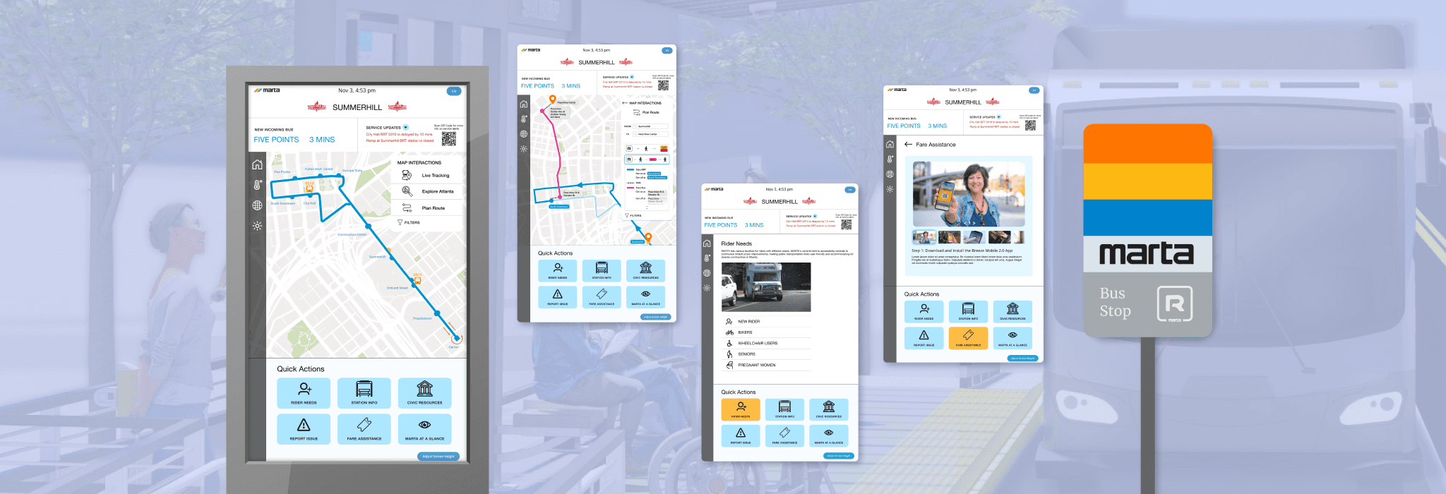
My team designed a wayfinding system within 65" touchscreens to be displayed at MARTA BRT stations, providing essential information that will help riders along their journey.
This video displays this interface's different features by demonstrating how a user may encounter each through different flows they may take when approaching this touchscreen at the station, depending on their needs and situation.
✦ INTRO
The Metropolitan Atlanta Rapid Transit Authority, also known as MARTA, is the public transport operator in the Atlanta metropolitan area and the 8th largest transit system in the US, serving 400,000 riders everyday.
As part of the MARTA 2040 expansion plan, MARTA proposed introducing Bus Rapid Transit (BRT), which uses dedicated lanes on the road and provides a "rail-like experience", to its lineup. This service is currently underway and scheduled to start service in 2025.
What makes this project special?
Our target user group currently does not exist! As the BRT system is a new mode of transportation for Atlanta and is still under construction, there are no MARTA BRT riders. With that in mind, we based our research on a range of MARTA riders with varying levels of riding experience, to inform our decisions and test our prototype.
✦ PROCESS


✦ RESEARCH & ANALYSIS
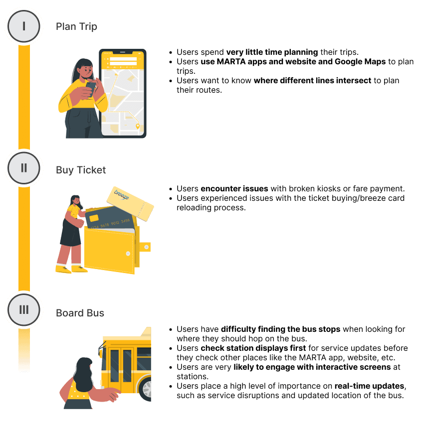
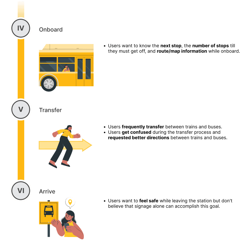
To ensure that we have a comprehensive understanding of user needs, we mapped out the stages of a MARTA rider's journey, from the planning transportation to the station to arriving at the desired location, to uncover every challenge and opportunity MARTA BRT riders may encounter.
THE JOURNEY of a MARTA RIDER
Semi-structured Interviews
Conducted 4 interviews with experienced MARTA riders from MARTA Rider's Advisory Council.
⤷ To understand how users think and feel during the rider journey and gain feedback on current signage at MARTA stations.
Contextual Inquiries
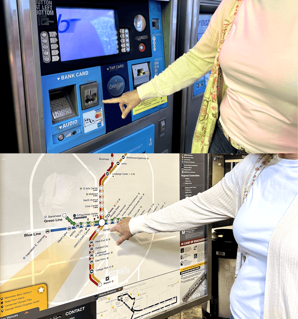
Compared 2 inquiries — daily rider vs. first-time rider who is also a native Spanish speaker.
⤷ To observe users' experiences and emotions as they think aloud and analyze how they process their environment.
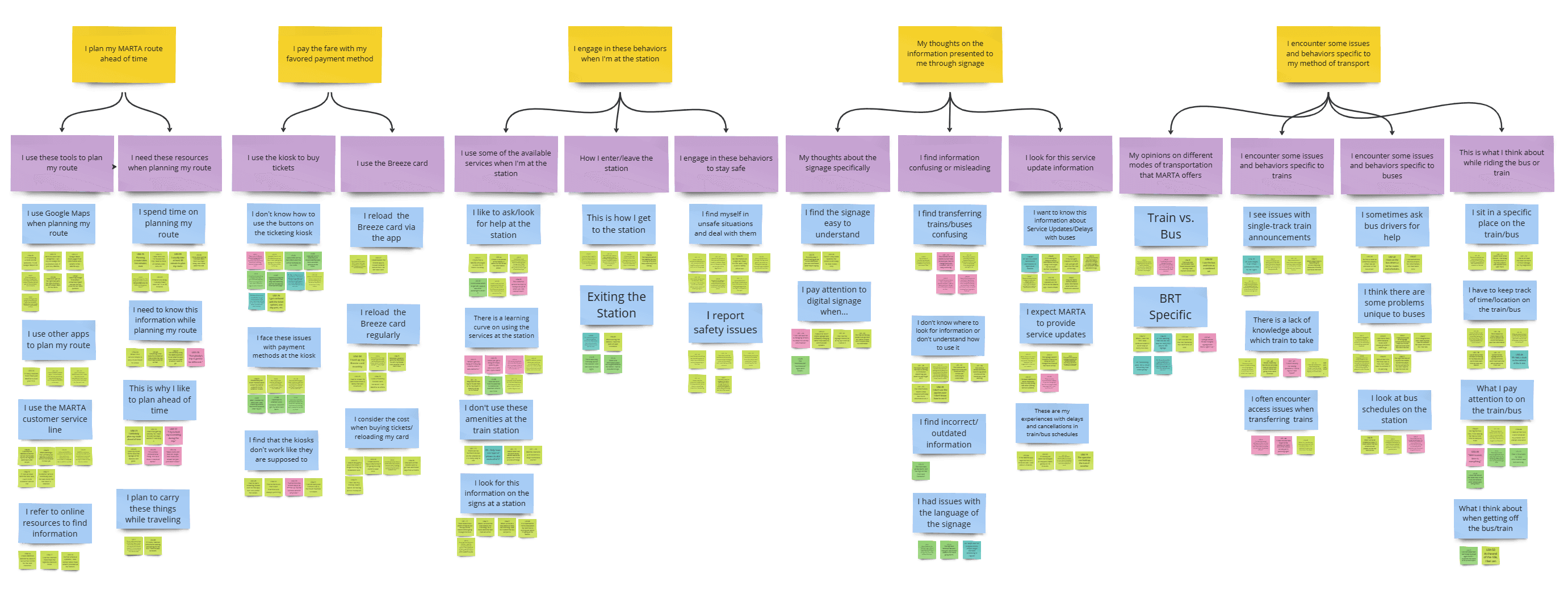
→ Affinity Mapping Analysis
We identified important quotes from users to draw insights and identify themes.
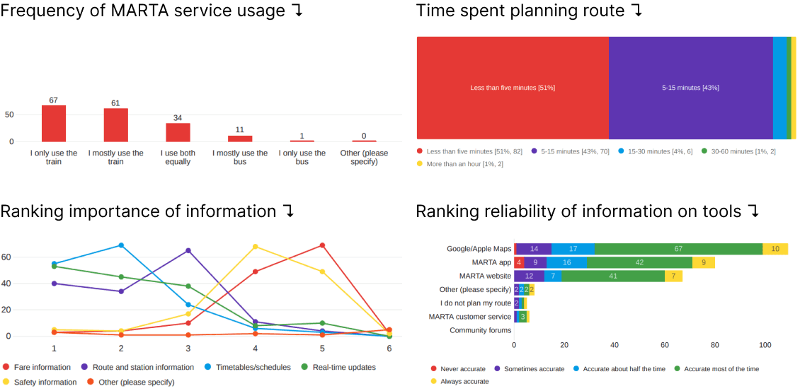
Survey
We collected 223 responses from riders who have used the MARTA in the last three months. We then analyzed the results through data visualizations provided by Qualtrics to collect demographic information and understand what needs should prioritized.
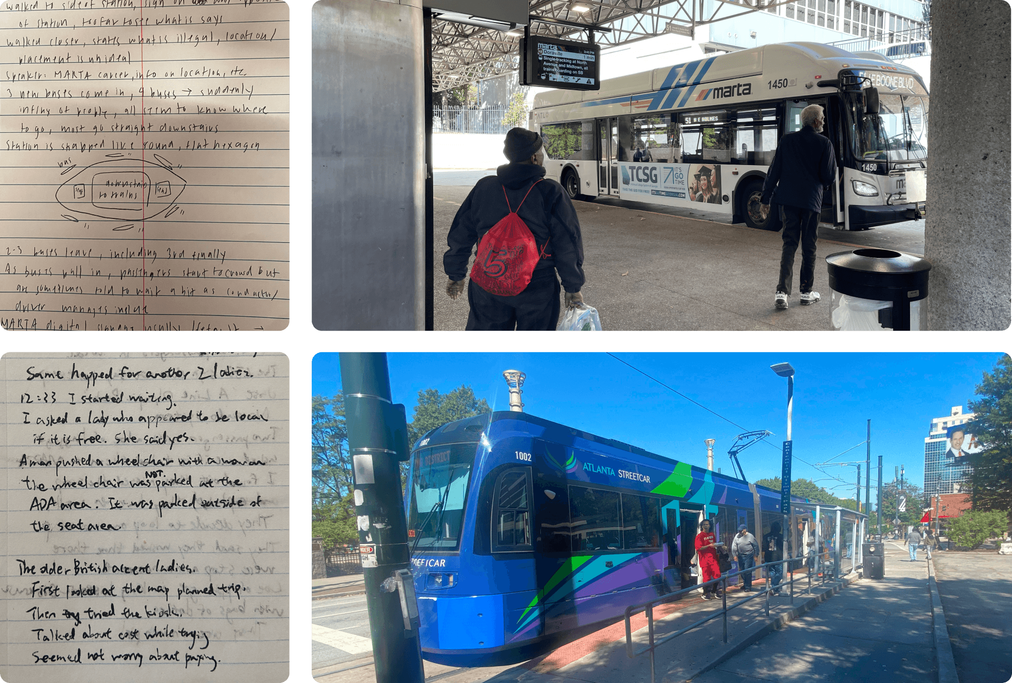
Ethnographic Observations
Conducted observations at 3 MARTA locations, 2 stations and 1 streetcar stop.
⤷ To gather notes on candid user behaviors outside of interviews and understand the environment where riders make decisions.
Comparative Analysis
Analyzed 3 well-established BRT systems from around the world.
⤷ To compare digital signage with different systems and gain inspiration for solutions to address the concerns of MARTA riders.
From our research, we identified recurring themes from our findings for each stage of the rider journey.
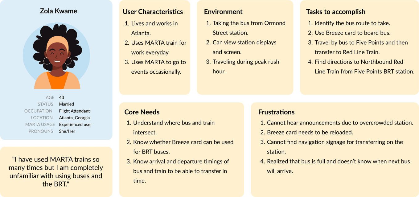
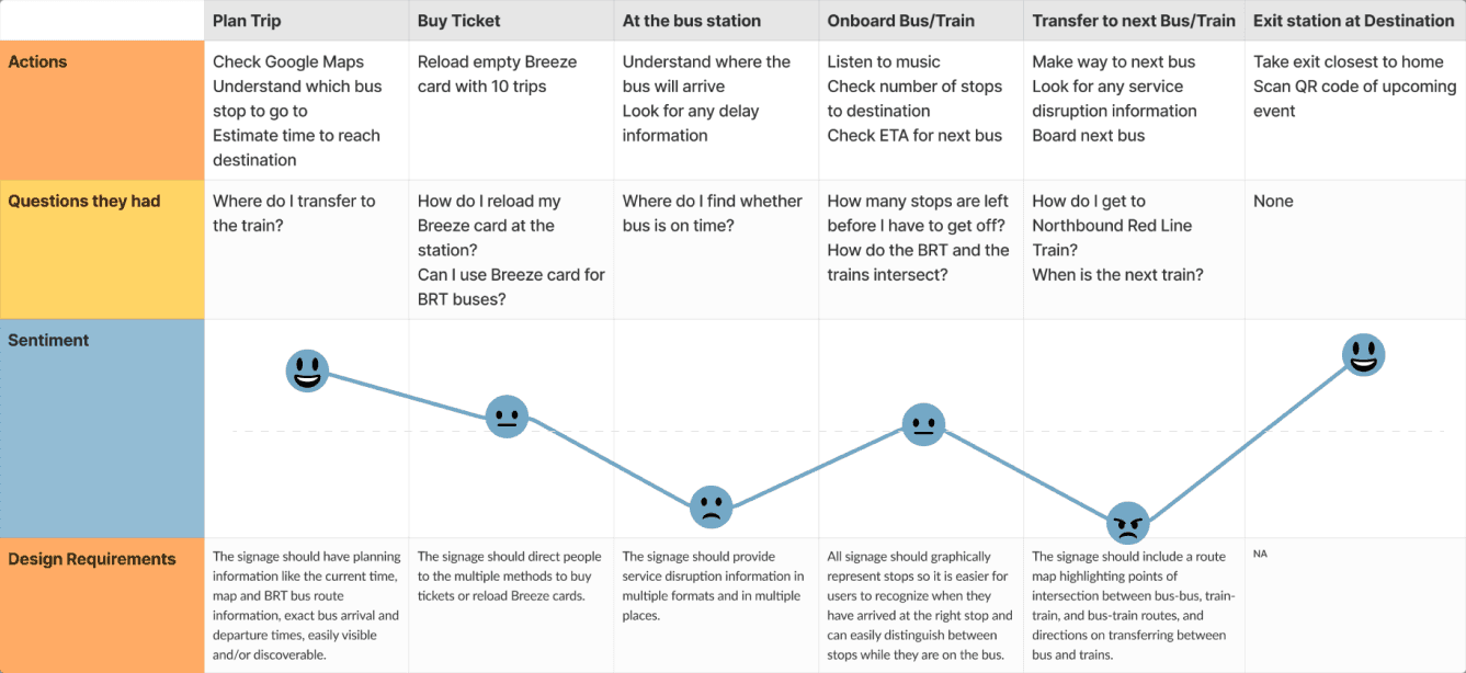
To ensure we accommodate for all MARTA BRT riders, we created 2 personas to represent users from opposite ends of the MARTA familiarity spectrum. Then, we developed user journeys to understand how these users would feel at each stage of the journey and highlight areas of improvement that we can tackle with our solution.
PERSONA 1 — The Commuter (lives in Atlanta, takes MARTA everyday)
PERSONA 2 — The Tourist (new to Atlanta, first time taking MARTA)
✦ DESIGN
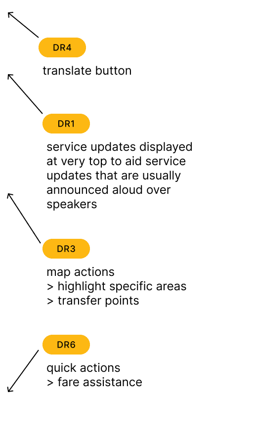
Once we gathered and analyzed our preliminary research, we devised a set of design requirements to guide our design process moving forward.
We then presented these to our project contact for feedback. Through this discussion, we narrowed down our initial requirements to 6. This decision was made based on what technology is available at the station as well as where MARTA thought we could create a high impact through our designs.
The digital wayfinding system should …
Design Brainstorm (Crazy 8's)
We ideated designs for each of the 6 requirements within 8 minutes, which we then discussed together as a team. Afterwards, I digitalized and organized my team's ideas onto a Miro Board.
⭐ Lo-fi Design Concepts
From the ideas we produced from our brainstorm, each team member concentrated their concepts in different directions to create features that focused on fulfilling different design requirements.
As we did not want to limit the design style this early on in the design process, we had not established a style guide just yet, which is why the concepts vary in style.
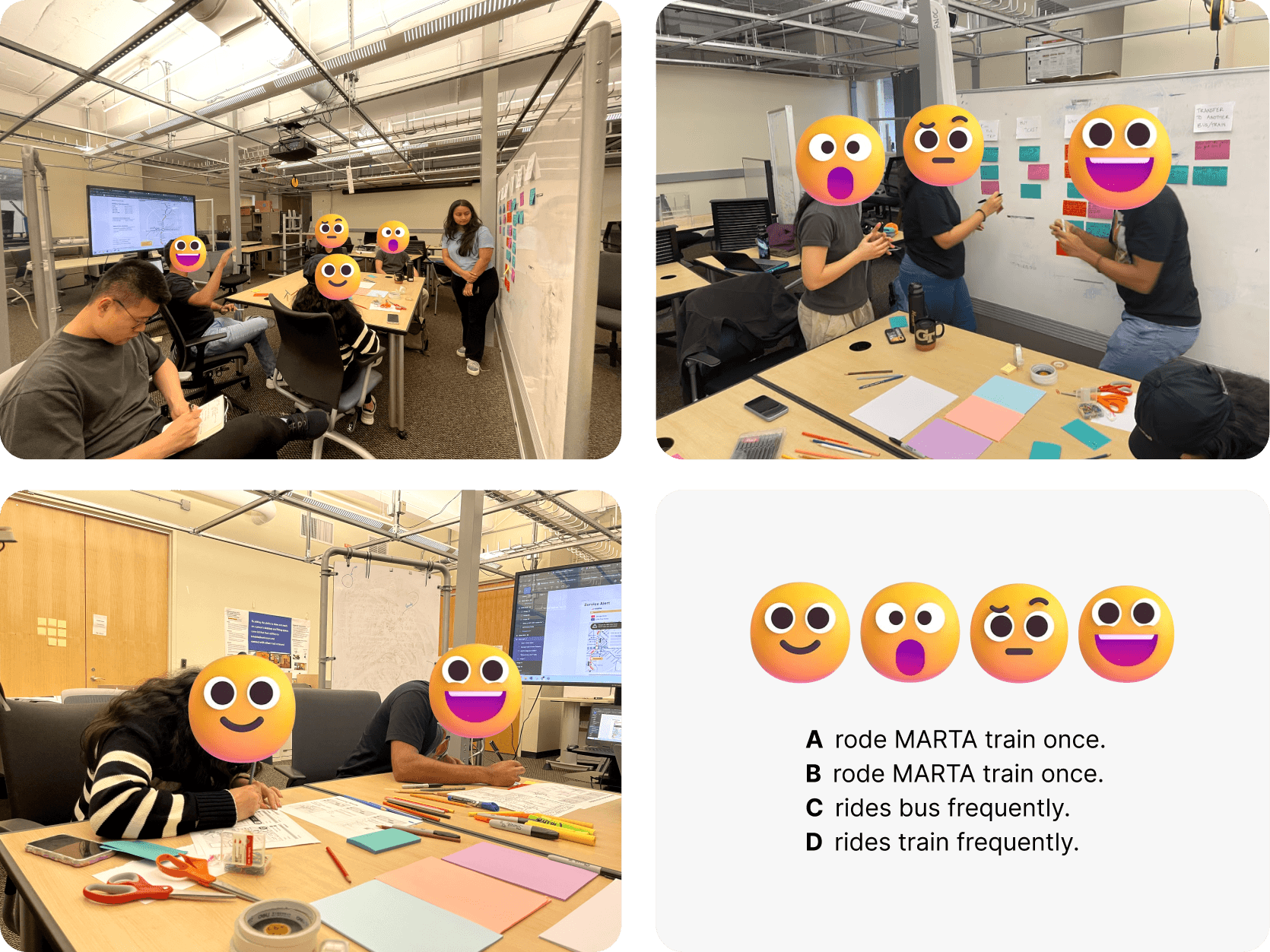
Participatory Workshop
Worked with 4 MARTA riders with varying levels of experience and familiarity with MARTA.
Recall experiences at each stage as they "walk the wall"
React to initial concepts with other participants
Suggest improvements by writing on printed out concepts
⤷ To gather feedback and generate ideas that stem from users' personal and lived experiences.
→ Post-workshop Analysis
Complied and categorized user feedback.
⤷ To determine action items and accomodate for those who may face difficulty with the screen's size.
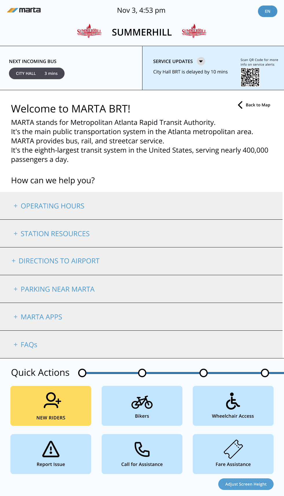
⭐ Mid-fidelity Wireframes
With the feedback we received, we established a layout and style guide that reflected MARTA's brand guidelines and polished our concepts by deciding what features to integrate to fulfill the design requirements.
Feedback Session
Worked with 4 MARTA riders and a 65" vertical screen.
Share reactions and thoughts on wireframes
Think aloud during task walkthrough
Test accessibility regarding height limitations
⤷ To provide an accurate simulation for rider's expectations and test effectiveness of accessibility features.
→ Post-session Analysis
Complied and categorized user feedback.
⤷ To review effectiveness at a more realistic scale and determine action items for next iteration.
✦ EVALUATION
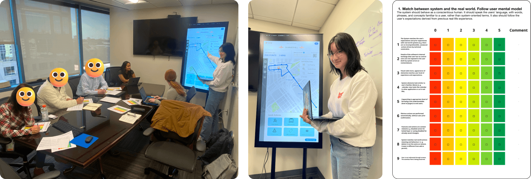
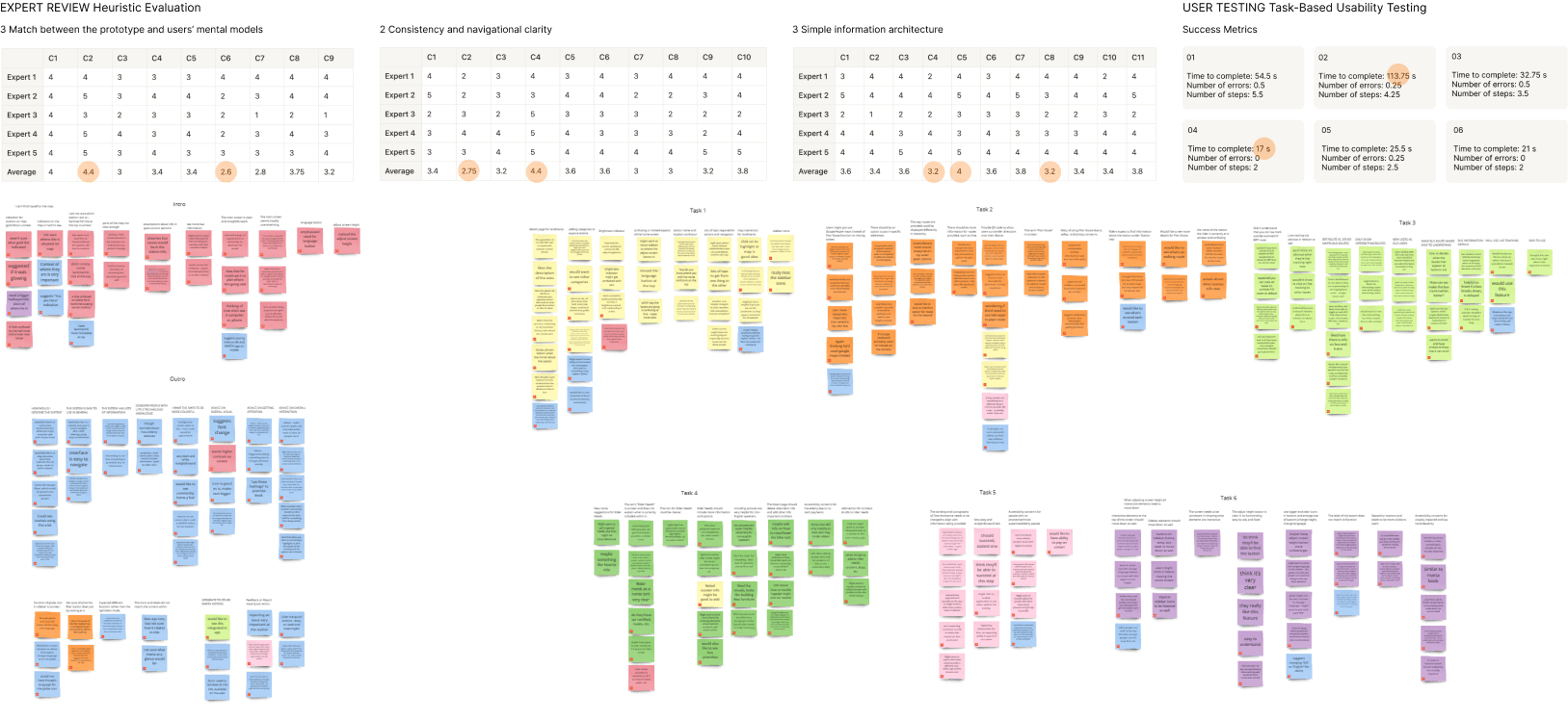
Once we finished refining our mid-fidelity wireframes into a high-fidelity prototype, we evaluated its success with 5 experts at MARTA HQ (2 content experts, 3 UX experts) and 4 MARTA users (MARTA's Rider's Advisory Council).
For both experts and users, we created a set of tasks to demonstrate flows through the prototype and test its usability and accessibility.
Task-Based Cognitive Walkthrough
Demonstrated the task flows to experts on a 65" screen.
⤷ To evaluate discoverability and validation of the design implementation and identify accessibility issues.
Heuristic Evaluation
Asked experts to evaluate each task flow based on 3 Jakob Nielsen heuristics.
⤷ To evaluate usability and evaluate consistency of the design.
Task-Based Usability Testing
Observed users as they perform the tasks on a 65" screen and measured success.
⤷ To measure the effectiveness in meeting user expectations and addressing accessibility concerns.
Semi-structured Interview
Asked users questions pre- and post- testing session about their thoughts.
⤷ To evaluate effectiveness in meeting user expectations and overall visual clarity of the prototype.
→ Evaluation Activity Results Analysis
We then complied the results from our Expert Reviews and User Testing evaluation activities.
To analyze, we highlighted standout numbers for the quantitative data (heuristic evaluation's average ratings from experts and task success metrics from users) and used affinity mapping for the qualitative data (comments from experts and interview answers from users).
⭐ Final Findings & Design Recommendations
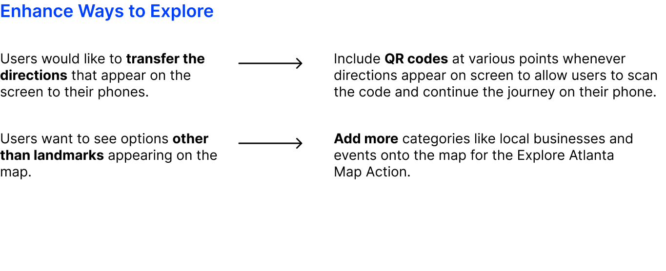
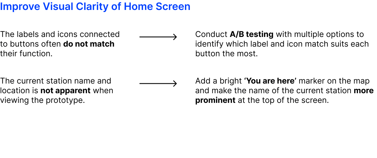
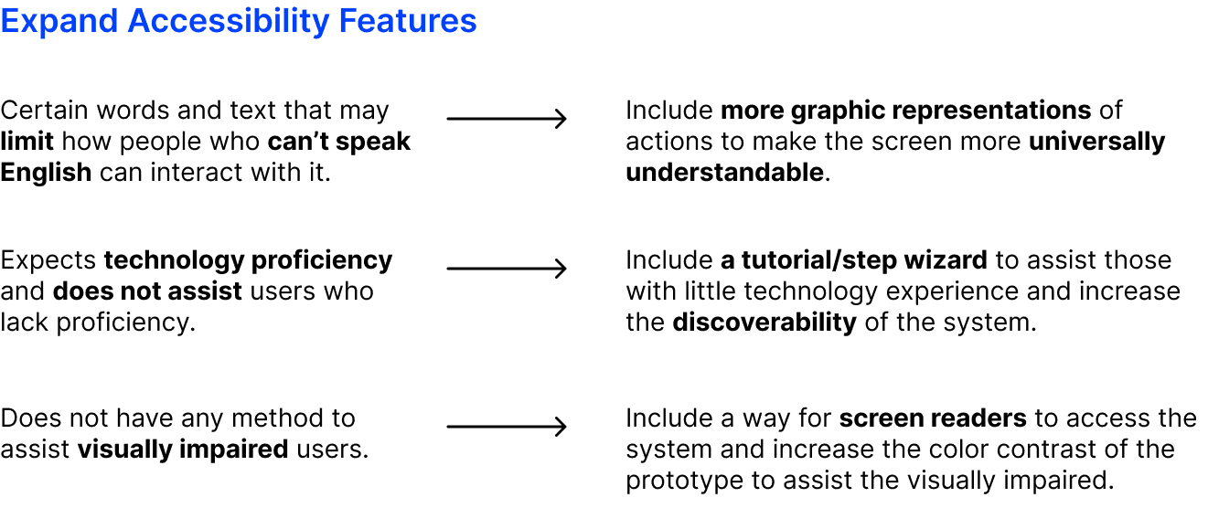
From there, we summarized our analysis in a list of 10 findings, each paired with a design recommendation that describes what we would continue to do for the next iteration.
Feature Suggestions and Improvements
Accessibility Concerns
✦ REFLECTION
It has been such an amazing experience working with my team on this project. This was one of first times I have ever done extensive research and design work for an end-to-end UX/UI project, and being able to collaborate with an industry partner on an ongoing project makes it feel as though we are truly making an impact — we even had the opportunity to present at MARTA HQ!
Moving forward…
Since this was a course project, we ultimately wrapped up our prototype at the end of the semester, which only allowed us to conduct one round of evaluation without having time to make any further edits. Reviewing the results we collected from the evaluation, we wish that we were able to integrate more interactions beyond the task flows we demonstrated.
If we continued to build this project, we would like to expand the accessibility features, such as adjusting font size and incorporating a screen reader, as well as make the map more interactive by allowing users to click on landmarks that pop up in the "Explore Atlanta" feature.


