Context
Gameplay Programming (CS Course @ UC Davis)
ROLE
Project Manager, Art Director, Visual Designer
Tools
Adobe Illustrator, Unity Game Engine, C#
TEAM
Yubo Di, kathy liu, huichueh lo, matthew thompson
TIMELINE
Mar - Jun 2021
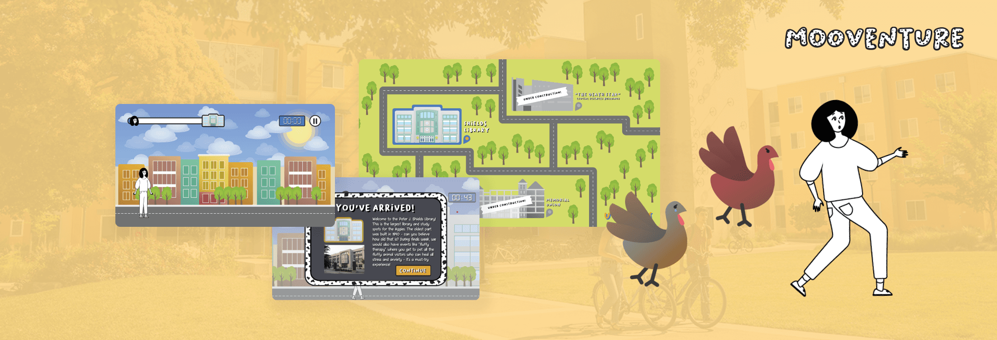
Mooventure is a 2D platformer game based on the UC Davis campus that challenges players to explore campus and race to notable buildings while attempting to dodge angry turkeys and absorbing speed boosts from energy drinks along the way.
As the Animations and Visuals role and Audio sub role, I led the aesthetic direction for the game by creating all visual assets, as well as sourcing royalty-free sound effects and music.
✦ INTRO — scene planning & flow storyboarding
Once we settled on this idea, I started creating sketches for different layouts / scenes of the game, visualizing how a player would navigate through our game, so I decided that our game should comprise of three scenes: a dorm (base), map (navigation), and level (active gameplay).
After getting the thumbs up from my team members, I began illustrating the backgrounds. I used photos from the actual UC Davis campus as inspiration, especially for the dorm and level scenes, which are modeled after a single-person dorm layout and the Tercero residence halls, respectfully.
These are backgrounds for each scene (click on the images for a closer, full-screen look). These images remain static, with the exception of the clouds in the level scene that have parallax scrolling to create more dimension, as the interactive gameplay components move on top.
✦ development — interaction & animation spritesheets
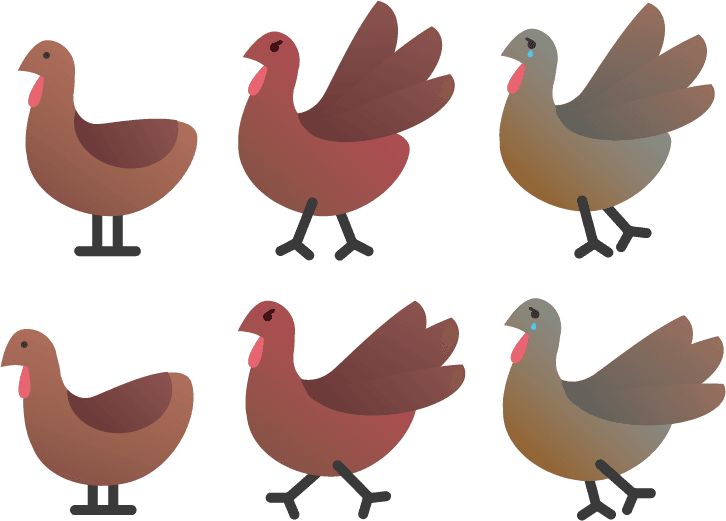
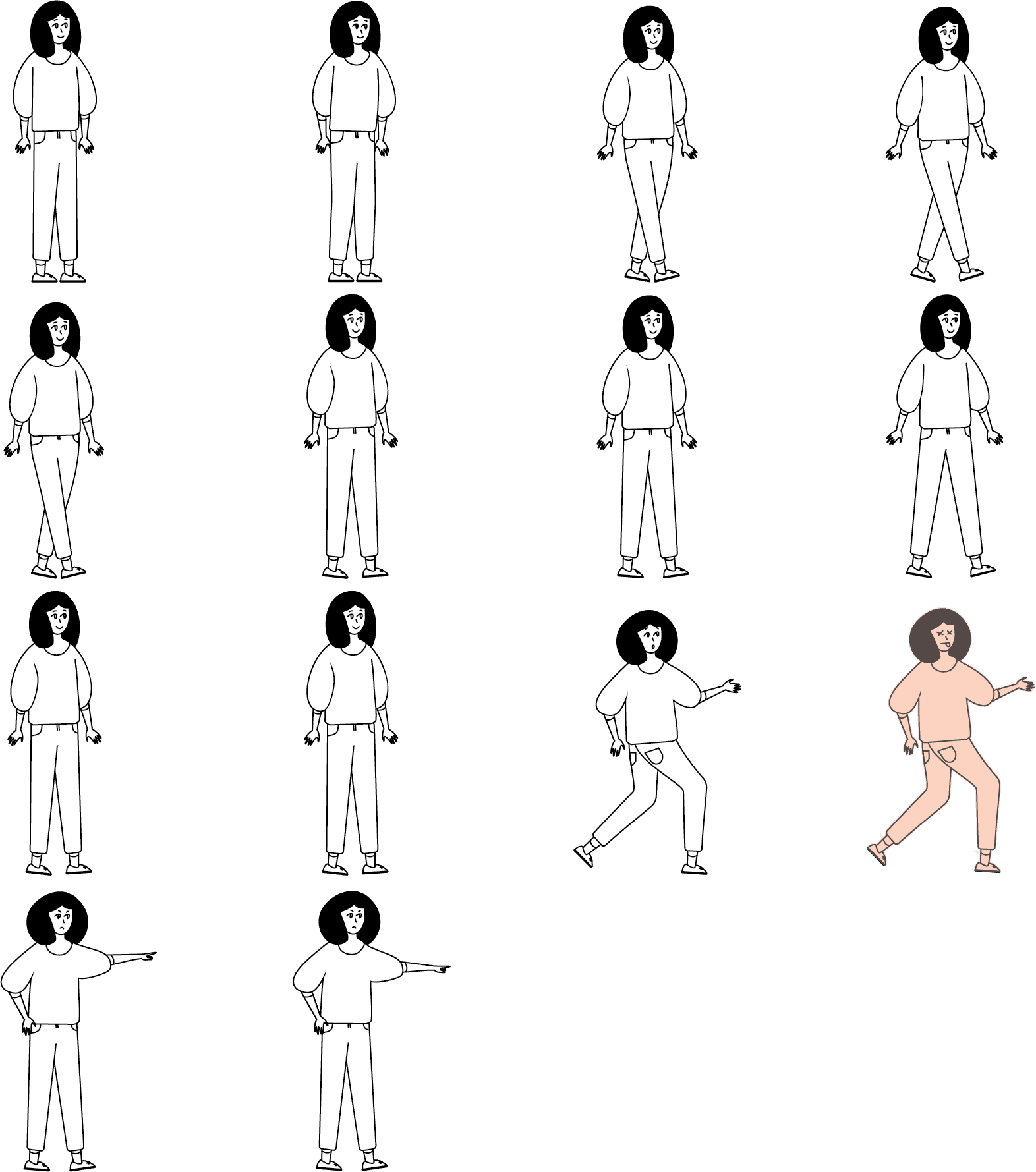
The interactive, animated components I created are the player’s character, turkey obstacles, and energy drink speed boosts. For the animations, I put together spritesheets, which map out the frames for all of the objects’ animated states, that give the objects a “stop-motion-esque” movement.
For the player’s character, since the rest of the game follows a warm-toned, gradient style, I decided to use a one-tone, outlined look with a black-and-white color palette to create contrast and allow the character to stand out for the rest of the game.
This sprite sheet includes the animation for walking, jumping, hurt, and shooing away. The walking animation has more frames than other animations (10 frames total) to make the movement more gradual and less abrupt.
✦ INTERFACE — STYLIZING BUTTONS AND WINDOWS
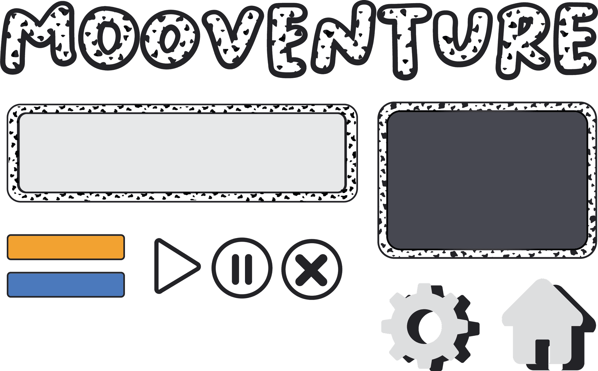
When creating the user interface, I created several iterations with different styles, varying from gradient to flat fills and color combinations. We also introduced the idea of gold and blue buttons to reflect UC Davis’ school colors.
After hours of discussion and testing, this is the finalized set of user interface assets that Ruoyang and I decided on. We decided on flat colors, similar to the character’s art style to more easily stand out to the player and differentiate the user interface from the game.
✦ DOCUMENTATION
In this document, I complied all of the finalized visuals and assets I created for this game, along with explanations on why I decided on certain colors, visuals, and so on.


